Original Site
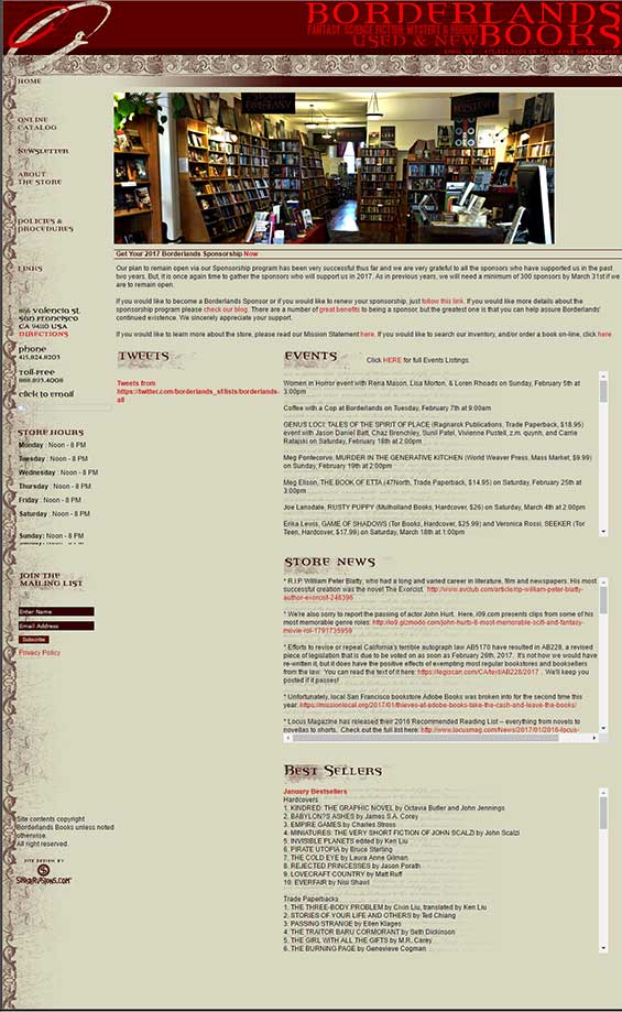
The original Borderlands website is text heavy and uses iframes to segment content.
Navigation is on the left and not immediately obvious. It also changes location and spacing on different pages
Section titles are image .gifs. This is bad for screen-readers and SEO.
In general this site presents accessibility challenges for people using screen-readers.
Colors
Colors are muted with low contrast. While gently pleasing to the eye, it does present additional accessibility challenges for people with low vision or near blindness.
Typography
Titles: Percolator Expert
Body: Arial, Verdana, Helvetica, sans-serif
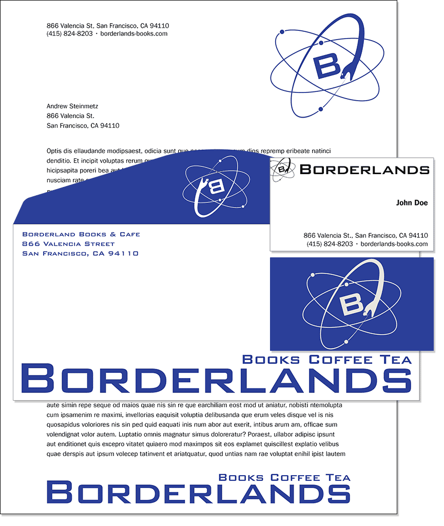
Stationary
Letterhead, envelope and business card
Swag
Buttons, To Go Cups, Mugs, Coffee, T-Shirts


Re-Design Process
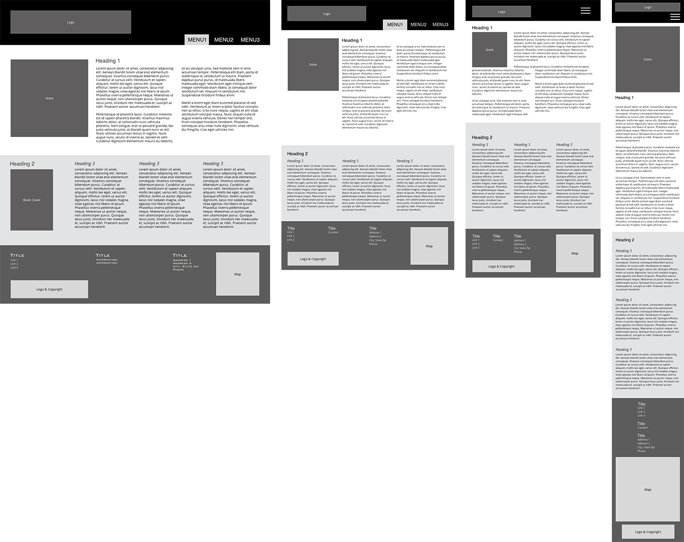
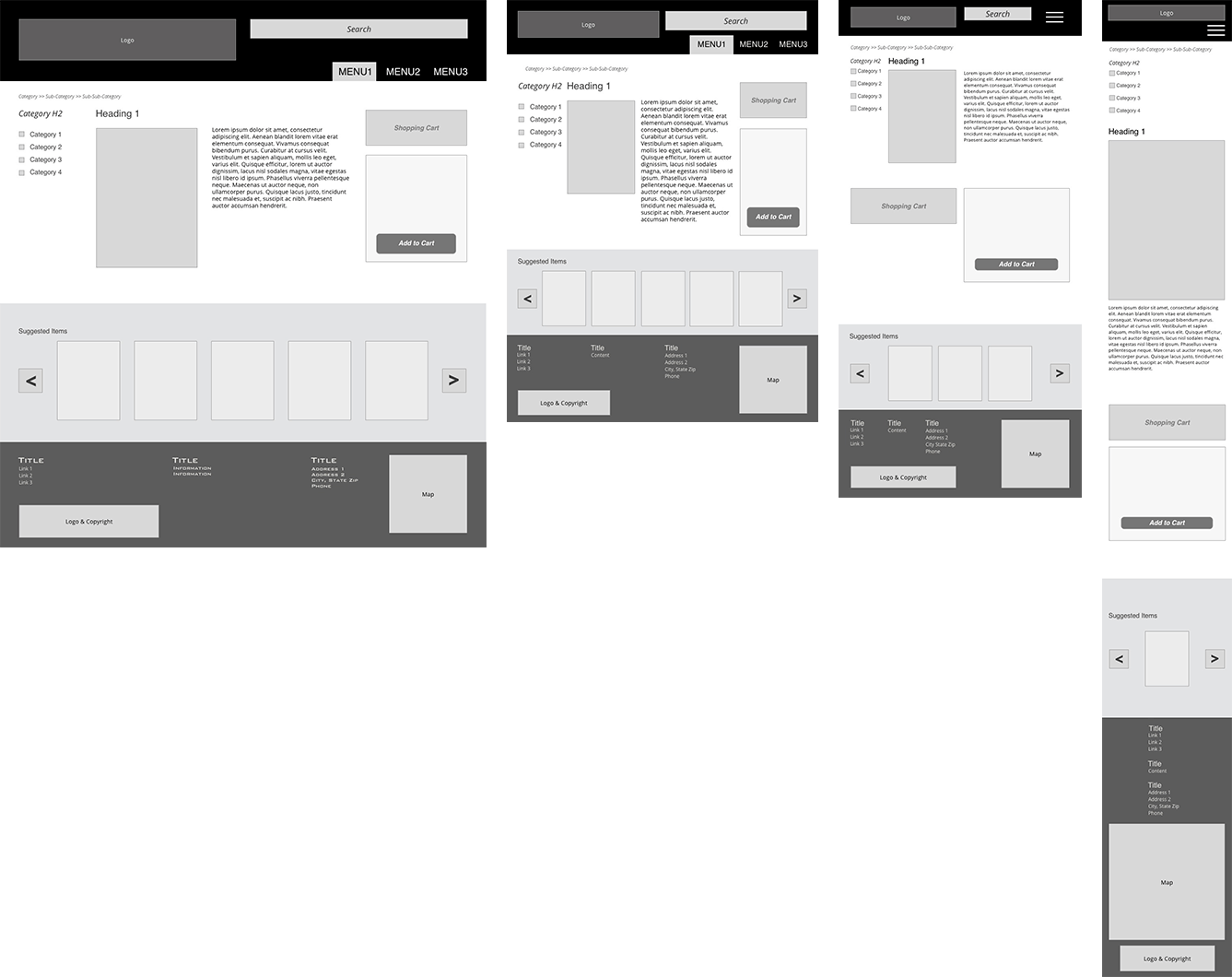
Wire-frames
1200px, 768px, 600px, and 320px Wide
Generally representative of desktop, small laptop / tablet, tablet, small phone
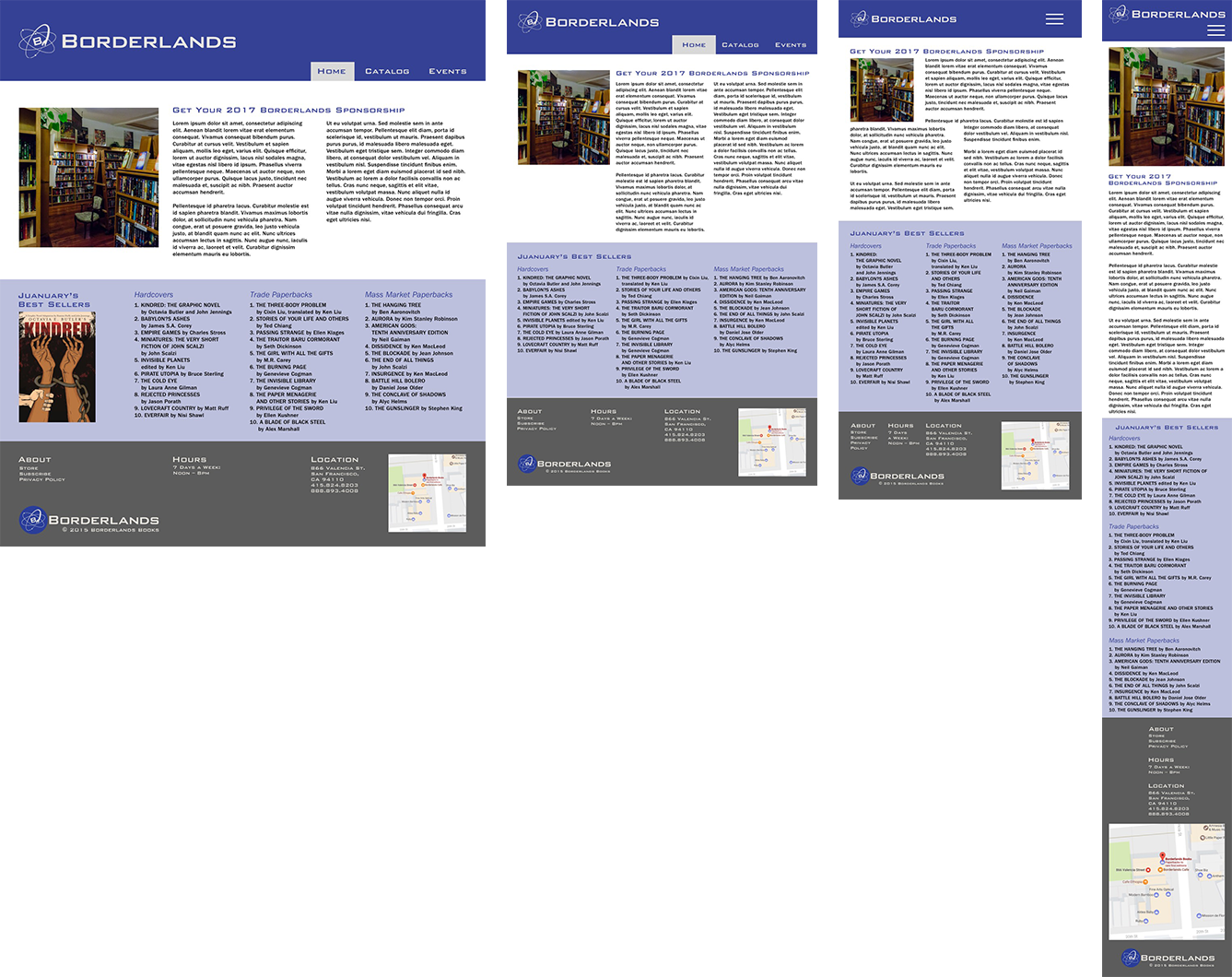
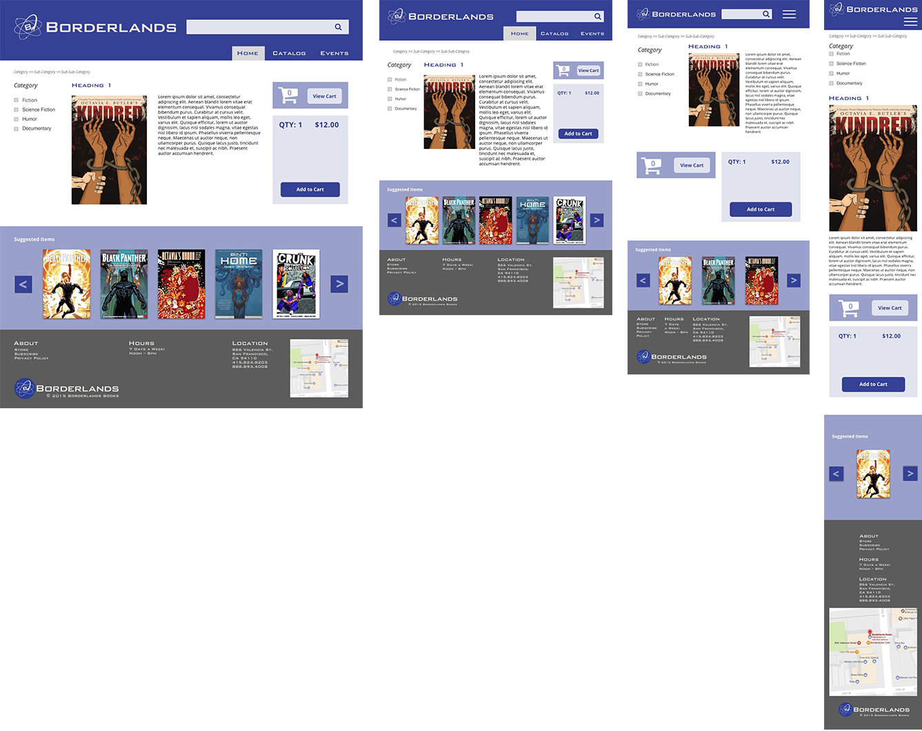
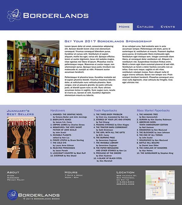
Responsive Comps
1200px, 768px, 600px, and 320px Wide
Generally representative of desktop, small laptop / tablet, tablet, small phone
C0% M0% Y0% K100%
R0 G0 B0
#000000
C98% M89% Y3% K0%
R41 G62 B152
#293E98
C0% M23% Y96% K0%
R255 G197 B28
#FFC51C
C9% M6% Y90% K0%
R231 G230 B221
#E7E6DD
Colors
As a fan of Science Fiction books, I decided to sample colors from the covers of 20 of the best selling SciFi books of all time.

Type
Print & Web: I chose Bank Gothic as the the typeface for the titles as it has a very clean modern feel.
Print: I chose Adobe Caslon for its classic, highly readable and deep roots in books.
Web: Open Sans is highly readable and different enough from Bank Gothic that it stands out. Additionally, it is a popular typeface on the web and is likely that it is already cached in most browsers.
